Color Palette: Beach Day

Color Palette: Beach Day

Samantha Remboldt

This "Beach Day" palette is inspired by the gentle hues of sand, sea, and sky, creating a calm and breezy aesthetic. With a mix of soft neutrals, airy blues, and warm wood tones, this palette is perfect for coastal-inspired brands, minimalist designs, and wellness-focused businesses. Whether you're working on branding, website design, or social media aesthetics, these colors bring a fresh and tranquil feel.

How to Use This Palette:

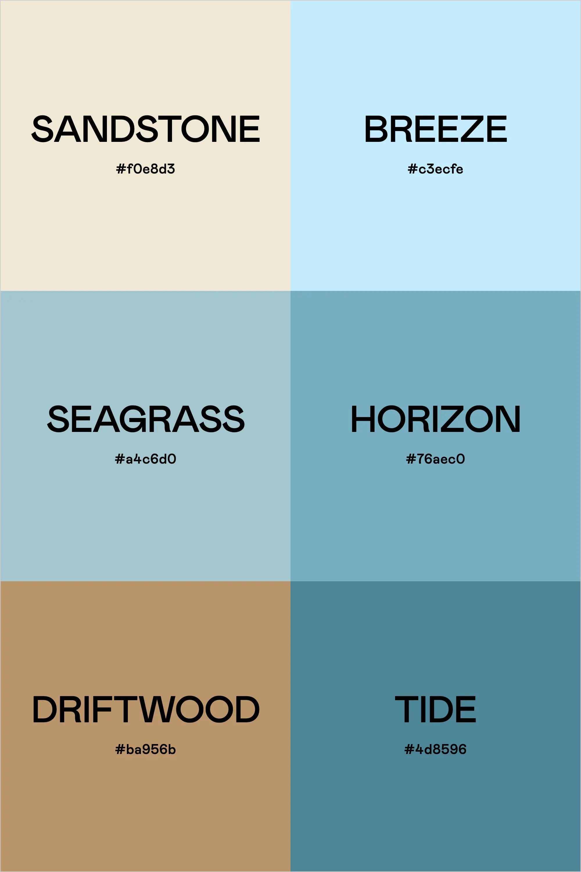
  • Sandstone (#f0e8d3) is a soft, warm neutral—perfect for backgrounds and text areas.
  • Breeze (#c3ecfe) adds a light, airy blue that creates a fresh and inviting feel.
  • Seagrass (#a4c6d0) and Horizon (#76aec0) bring soothing ocean tones, ideal for accents and design elements.
  • Driftwood (#ba956b) adds warmth and contrast, balancing the cooler tones beautifully.
  • Tide (#4d8596) grounds the palette with a deep coastal blue, great for typography and call-to-action elements.

This palette captures the relaxed essence of a perfect beach day, making it ideal for modern, effortless branding with a natural, coastal-inspired feel.

Hex Codes:

  • Sandstone: #f0e8d3
  • Breeze: #c3ecfe
  • Seagrass: #a4c6d0
  • Horizon: #76aec0
  • Driftwood: #ba956b
  • Tide: #4d8596
Back to blog

★ ★ ★ ★ ★

Say hello to your new favorite color palette tool:

Color Palette PRO

Excellent 4.97 | Trusted by 1,000+ Designers

Create beautiful, brand-ready color palettes in 60 seconds.

Our all‐in‐one tool helps you select, test, and finalize your brand’s perfect palette—without the guesswork.

Get Color Palette PRO

Read the Reviews

"Wow, I love this! It's insanely useful!! From generating themed names to contrast compliance - this tool is so much fun to use and saved me a ton of time."

Customer Reviews

Based on 70 reviews
94%
(66)
4%
(3)
1%
(1)
0%
(0)
0%
(0)
J
Julia B.
SO helpful

This tool has been an amazing addition to my design process. I'm so glad I got it! its such a time saver and it lays everything out really well. I highly recommend it!

M
Megan D.
I'm Obsessed!

I've been a fan of their tools from the beginning, but I've got to say the new Color Palette Pro is the best yet! As a web designer this is the first place I go to take my clients' inspiration and create a palette that's uniquely them, but also meets contrast guidelines. It's so much fun to use I could spend hours just creating amazing palettes. There's so much here, I could go on and on, do yourself a favor and grab this tool!

K
Kelly D.
The Graphic Designer's Best Friend

WOW! This is the best tool and I love using it regularly for branding, graphic design, and web development projects. I highly recommend it to improve your creative process. Bonus: it's super fun to use, too!

I
Ingrid U.
Saves me SO much time and it's fun to use!

I love playing with color and going down the rabbit hole of color psychology and this is so helpful in letting me explore different combinations and good balanced palettes!!

K
Krista H.
new and improved color palette pro

I love the color palette pro! It is so easy to navigate and very intuitive, and it allows you to create a great palette in a few easy steps.