This "Avocado Toast" palette is a rich mix of warm greens, deep neutrals, and soft golds, making it perfect for brands that want to feel organic, grounded, and sophisticated. Inspired by the natural hues of avocado, whole grains, and earthy textures, this palette works beautifully for eco-friendly brands, wellness businesses, and minimalist aesthetics.
How to Use This Palette:
-
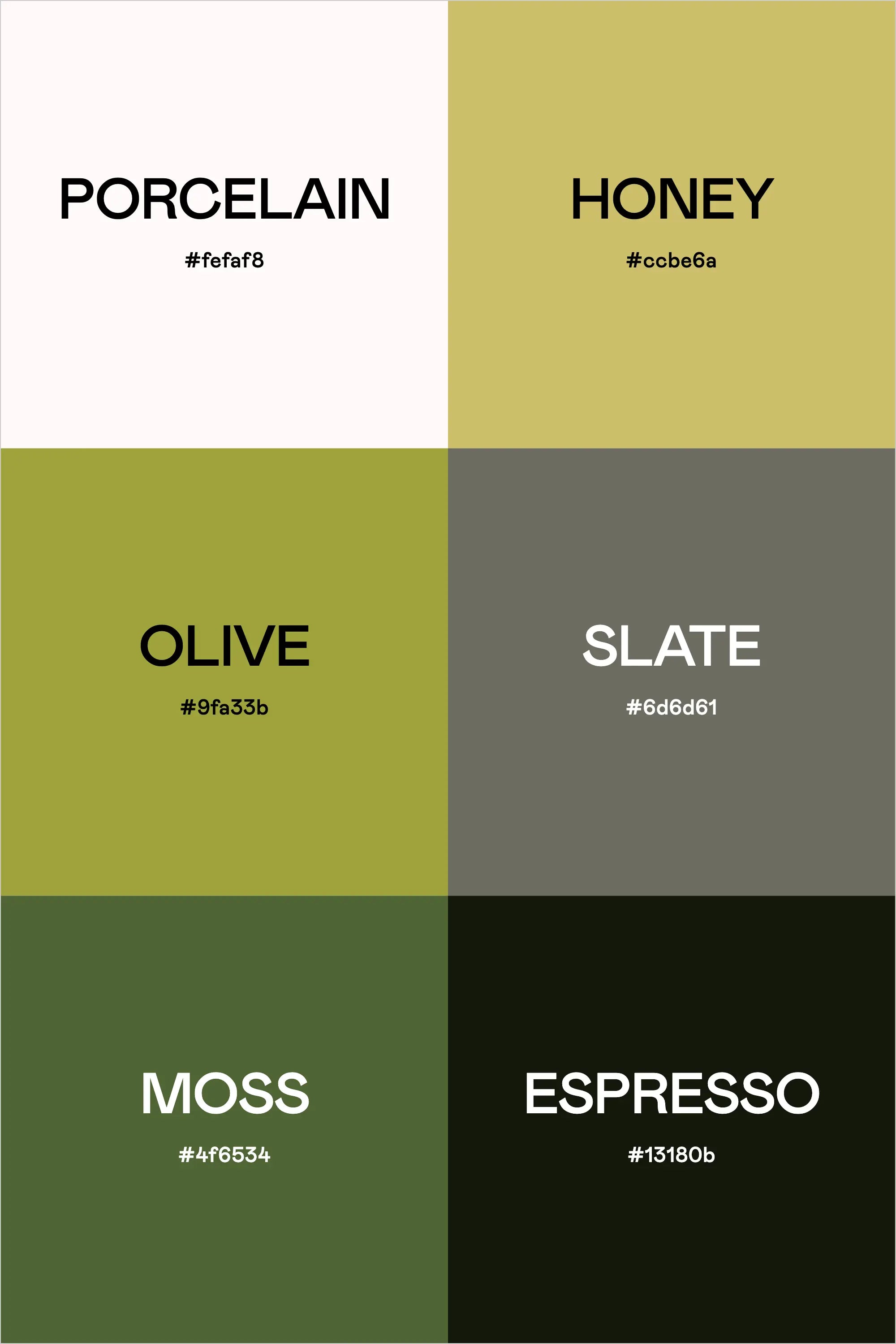
Porcelain (#fefaf8) is a clean, off-white shade—great for backgrounds and typography to keep designs fresh and airy.
-
Honey (#c0be6a) adds warmth and balance, ideal for accents, buttons, or brand highlights.
-
Olive (#9fa33b) and Moss (#4f6534) bring in the organic green tones, perfect for nature-inspired designs, branding, or packaging.
-
Slate (#6d6d61) provides a grounding neutral for text, borders, and subtle contrast.
-
Espresso (#13180b) adds depth and boldness, making it great for typography, logos, or dark mode aesthetics.
This palette is earthy yet refined, making it ideal for brands that embrace sustainability, wellness, and organic living.
Hex Codes:
-
Porcelain: #fefaf8
-
Honey: #c0be6a
-
Olive: #9fa33b
-
Slate: #6d6d61
-
Moss: #4f6534
-
Espresso: #13180b