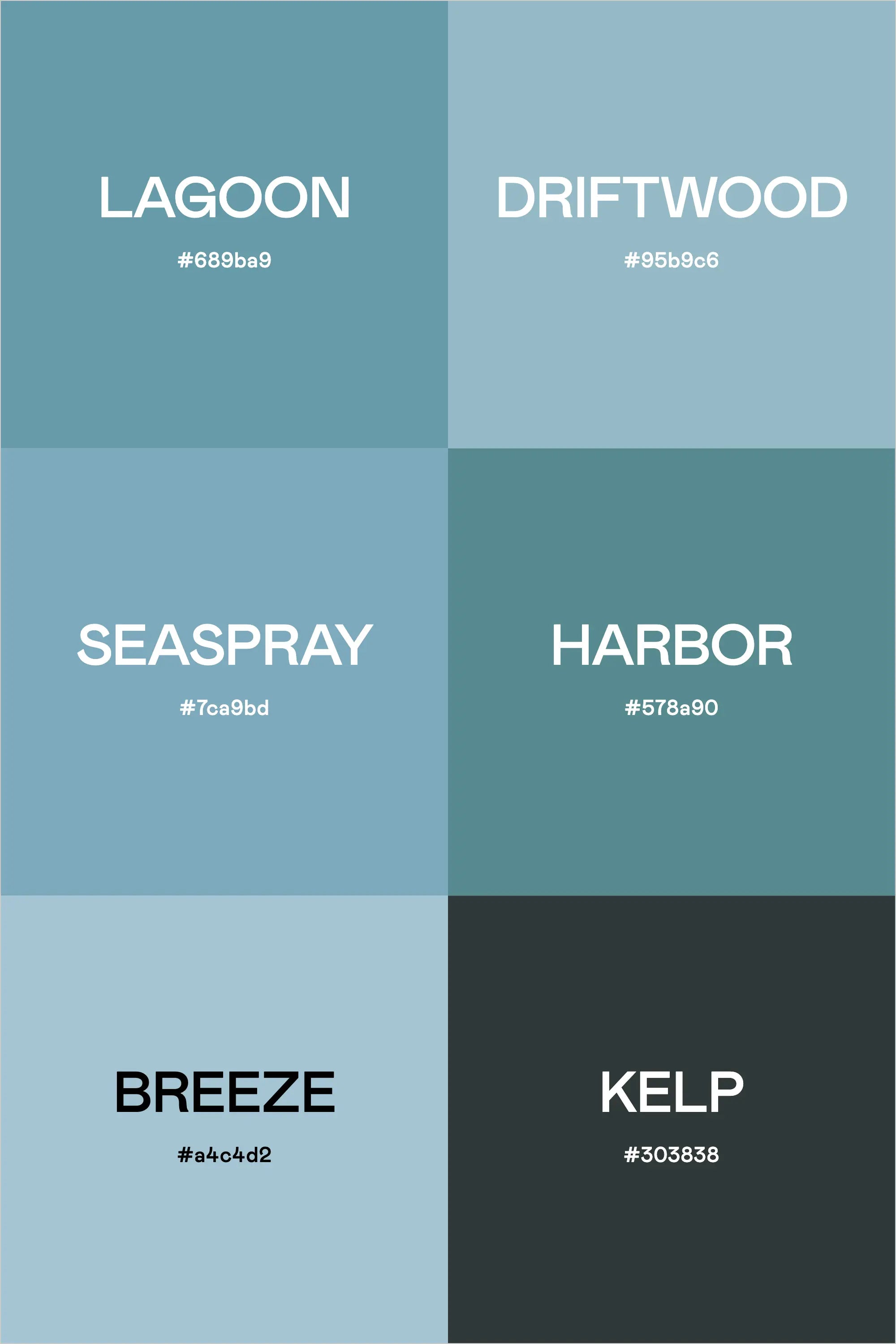
Like a foggy morning along the shoreline, this palette captures the subtle beauty of coastal environments through a sophisticated collection of sea-inspired blues and greens. Each color feels as if it was lifted directly from nature, creating a harmonious blend that's both calming and refined.
The Palette Breakdown
This six-color collection evokes different aspects of coastal environments:
Lagoon (#689ba9) sets a rich, aquatic foundation, while Driftwood (#95b9e6) provides a lighter, weathered blue reminiscent of sun-bleached wood. Seaspray (#7ca9bd) captures the essence of ocean mist, complemented by Harbor (#578a90), which brings deeper, more saturated teal tones to mind.
The palette is completed by Breeze (#a4c4d2), offering a soft, atmospheric blue, and Kelp (#303838), providing a deep, anchoring tone that recalls the mysterious depths of tidal pools.
Perfect Applications
This palette excels in:
- Luxury Coastal Properties
- Marine Conservation Organizations
- Spa and Wellness Brands
- Sustainable Ocean Products
- Coastal Hospitality
- Environmental Education
- Oceanfront Retail
Design Strategy Tips
1. Use Kelp for grounding elements and primary text
2. Apply Breeze and Driftwood for main content areas
3. Employ Harbor and Lagoon for key brand elements
4. Layer Seaspray with other tones to create depth
Digital Implementation
For digital applications, consider these approaches:
- Use Breeze or Driftwood as primary background colors
- Apply Harbor or Lagoon for navigation and interactive elements
- Reserve Kelp for text and important calls-to-action
- Implement Seaspray for hover states and transitions
Brand Expression
This palette communicates:
- Coastal serenity
- Environmental awareness
- Natural luxury
- Mindful living
- Ocean stewardship
- Refined simplicity
Final Thoughts
The "Coastal Mist" palette offers a sophisticated take on seaside-inspired design. Its careful balance of light and deep tones creates a versatile foundation for brands that want to convey both tranquility and depth, perfect for any project that aims to capture the essence of coastal living.
Ready to Create Your Own Perfect Palette?
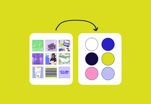
If you're inspired by this serene coastal palette, you might be wondering how to create similarly effective color combinations for your own projects. That's exactly why I created the Color Palette Builder - a professional tool that helps designers create semi-custom, ready-to-use color palettes in minutes.
With the Color Palette Builder, you can:
- Choose your color palette using distinct design styles, each with its own carefully crafted color formula
- Create unique, professional color combinations that work harmoniously together
- Test your palette combinations instantly
- Export your palettes in multiple formats for client presentations
- Save and revisit your favorite palettes anytime
Ready to revolutionize your color palette creation process? See below to learn more about the Color Palette Builder and start creating professional-grade color palettes today.
Enjoyed this color palette breakdown? Share it with a fellow designer who might find it helpful!

