Like a perfectly manicured campus lawn on a spring morning, this palette captures the essence of academic tranquility. The combination of blues and greens creates a refreshing color story that feels both scholarly and natural, perfect for educational and institutional design.
The Palette Breakdown
This six-color collection draws inspiration from the natural elements of campus landscapes:
Pond (#b4d5f6) starts us off with a serene light blue reminiscent of reflection pools and clear morning skies. Its counterpart, Meadow (#678c01), provides a rich green that calls to mind well-maintained lawns and mature trees.
Harvest (#a6a817) adds a distinctive olive tone that brings warmth and depth, while Breeze (#e4f1f9) offers a crisp, airy blue-white that feels clean and fresh.
Stream (#649ada) provides a medium blue that adds energy and movement, complemented by Sprout (#b5d647), a vibrant yellow-green that captures the vitality of new growth.
Perfect Applications
This palette excels in:
- Educational Institutions
- Research Organizations
- Environmental Nonprofits
- Scientific Publications
- Health and Wellness Programs
- Sustainable Initiatives
- Professional Development Services
Design Strategy Tips
1. Use Meadow for primary brand elements and important headers
2. Apply Breeze for content backgrounds and clean spaces
3. Employ Stream for interactive elements and calls-to-action
4. Layer Sprout and Harvest for visual interest in secondary elements
Digital Implementation
For digital applications, consider these approaches:
- Use Breeze as your primary background color
- Apply Stream for navigation and important links
- Implement Meadow for key buttons and CTAs
- Utilize Sprout for success states and positive indicators
Brand Expression
This palette communicates:
- Academic excellence
- Environmental consciousness
- Institutional stability
- Growth and development
- Natural wisdom
- Professional learning
Final Thoughts
The "Campus Green" palette strikes a perfect balance between professional authority and natural vitality. Its combination of calming blues and energetic greens creates an atmosphere that's both scholarly and welcoming, ideal for institutions that want to project stability while encouraging growth and learning.
Ready to Create Your Own Perfect Palette?
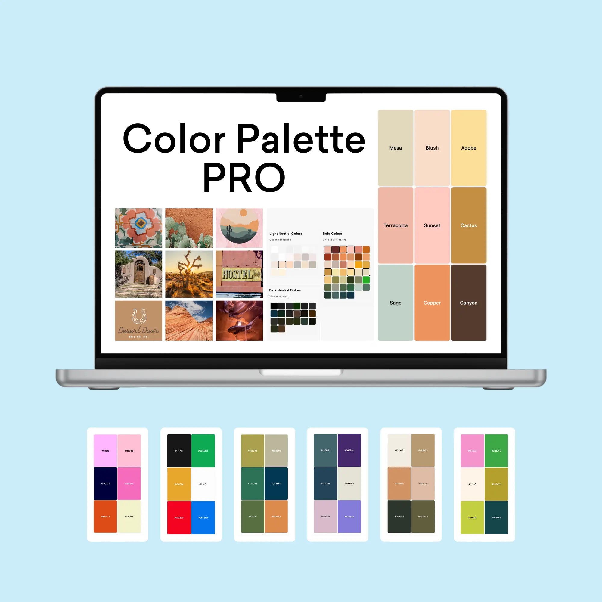
If you're inspired by this educational-inspired palette, you might be wondering how to create similarly effective color combinations for your own projects. That's exactly why I created the Color Palette Builder - a professional tool that helps designers create semi-custom, ready-to-use color palettes in minutes.
With the Color Palette Builder, you can:
- Choose your color palette using distinct design styles, each with its own carefully crafted color formula
- Create unique, professional color combinations that work harmoniously together
- Test your palette combinations instantly
- Export your palettes in multiple formats for client presentations
- Save and revisit your favorite palettes anytime
Ready to revolutionize your color palette creation process? See below to learn more about the Color Palette Builder and start creating professional-grade color palettes today.
Enjoyed this color palette breakdown? Share it with a fellow designer who might find it helpful!


