Remember the excitement of opening a fresh box of markers or colored pencils? This "Pencil Box" palette captures that same sense of creative possibility, combining vibrant primary colors with sophisticated undertones that make it surprisingly versatile for professional applications.
Understanding the Palette
This six-color palette brings together bold primaries and their sophisticated counterparts, creating a dynamic range that feels both playful and purposeful. Let's explore each color and its potential applications:
Tangerine (#eb7006) leads with a burst of energy, offering a warmer, more approachable alternative to standard orange. Its vibrancy makes it perfect for call-to-action elements and attention-grabbing headlines.
Sprout (#099808) provides a fresh, energetic green that brings life and vitality to any design. Unlike traditional primary greens, this shade has a natural, organic quality that feels both modern and grounded.
Raspberry (#e20f44) offers a bold pink-red that commands attention while maintaining sophistication. It's more nuanced than a standard primary red, making it versatile for both playful and professional applications.
Cocoa (#4d241e) grounds the palette with its rich, earthy tone. This sophisticated brown acts as an excellent neutral alternative to black, softening the overall impact while maintaining visual weight.
Cobalt (#000cb6) delivers classic blue at its most confident, while Breeze (#91c0f8) offers its lighter, more approachable counterpart. Together, they provide depth and versatility to the palette.
Strategic Applications
This palette excels in several key areas:
- Education and Learning Platforms
- Creative Services and Art Supplies
- Children's Brands (with sophisticated appeal)
- Innovation and Technology Companies
- Creative Professional Services
- Modern E-commerce Brands
Design Strategy Tips
When working with this vibrant palette, consider these professional guidelines:
1. Balance is key: Pair one bold color (Tangerine, Raspberry, or Cobalt) with Breeze or Cocoa for sophisticated balance.
2. Create depth: Layer Breeze over Cobalt for dimensional effects that maintain readability.
3. Use Cocoa strategically: This rich brown can replace black in many applications, creating a softer but still professional feel.
4. Consider white space: These colors are powerful - giving them room to breathe can enhance their impact.
Digital Implementation Strategies
For digital applications, consider these professional approaches:
- Use Tangerine or Raspberry sparingly for important interactive elements
- Leverage Breeze for background elements and overlays
- Reserve Cobalt for trustworthy, reliable brand elements
- Apply Sprout to represent growth, progress, or success states
Brand Story Applications
This palette tells a story of creativity tempered with professionalism. It works particularly well for brands that want to convey:
- Innovation with approachability
- Creativity with structure
- Playfulness with purpose
- Energy with expertise
Practical Implementation Tips
When implementing this palette in your brand system:
1. Document clear hierarchy guidelines for color usage
2. Establish specific use cases for each color in your digital interfaces
3. Create guidelines for color combinations in different contexts
4. Define accent color applications versus primary brand color usage
Looking Forward
The versatility of this palette makes it adaptable for various brand evolution scenarios. Its range of bold and subtle options provides room for growth while maintaining brand recognition.
Final Thoughts
The "Pencil Box" palette demonstrates how traditionally playful colors can be combined to create a sophisticated and versatile brand tool. By thoughtfully balancing vibrant primaries with more nuanced tones, this palette provides a foundation for creating memorable, effective design work that can grow with your brand.
Ready to Create Your Own Perfect Palette?
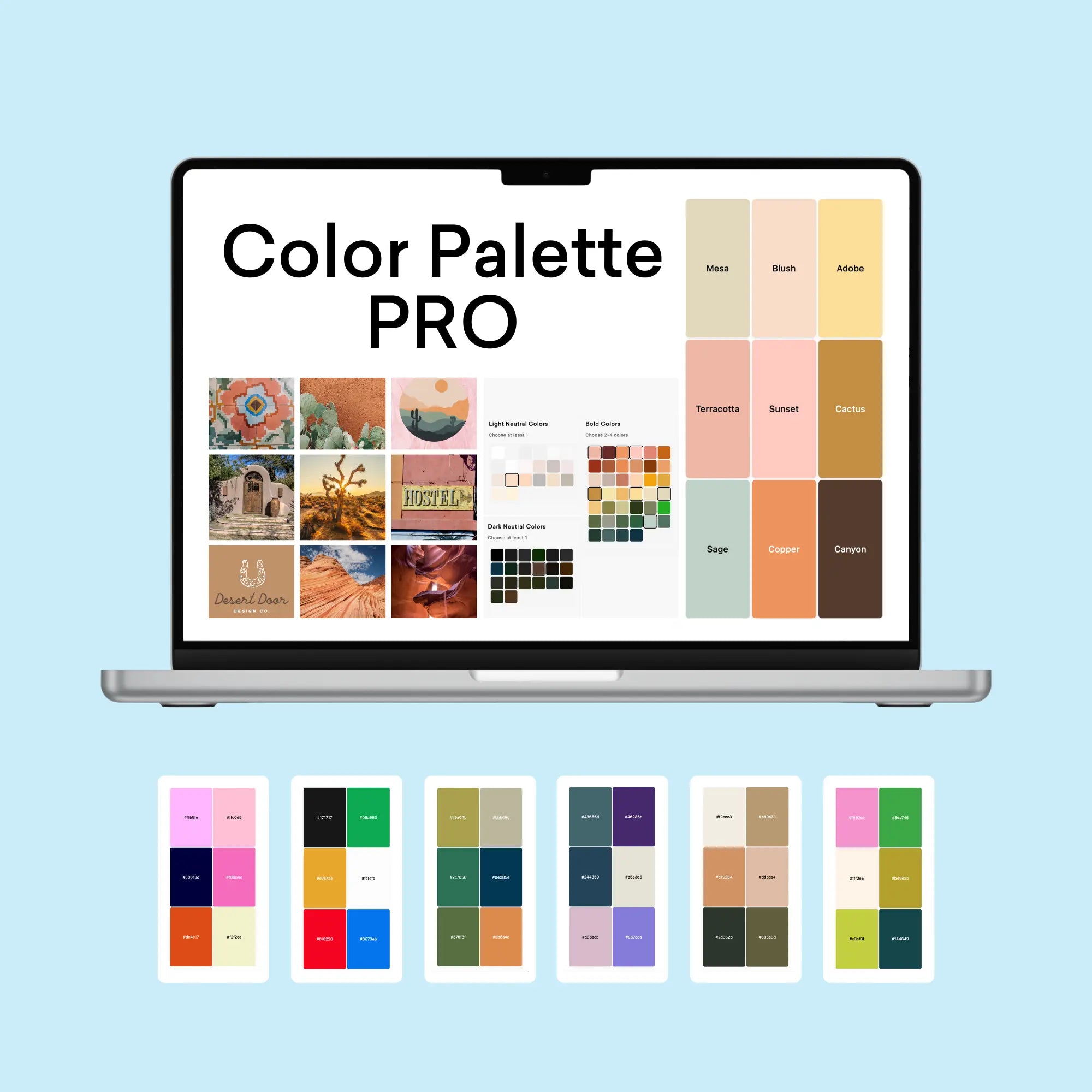
If you're inspired by this playful yet professional color combination, you might be wondering how to create similarly effective palettes for your own projects. That's exactly why I created the Color Palette Builder - a professional tool that helps designers create semi-custom, ready-to-use color palettes in minutes.
With the Color Palette Builder, you can:
- Choose from distinct design styles, each with its own carefully crafted color formula
- Create unique, professional color combinations that work harmoniously together
- Test your palette combinations instantly
- Export your palettes for client presentations
- Use our free Color Buddy Chrome extension to save and revisit your favorite palettes anytime
Instead of spending hours perfecting your color combinations, you can use our proven formulas to create beautiful, functional palettes in 60 seconds or less. Join over 1,000 designers who have already transformed their color selection process.
Ready to revolutionize your color palette creation process? Check out our tools below and start creating professional-grade color palettes today.
Enjoyed this color palette breakdown? Share it with a fellow designer who might find it helpful!