When it comes to color palettes, sometimes the most powerful statements come from exploring the depths of a single hue. Today, we're diving into what we're calling the "Blueberry Blast" palette - a sophisticated exploration of blue that proves how versatile and impactful monochromatic design can be.
The Spectrum of Blue
This carefully curated palette features six distinctive blue tones that work in perfect harmony:
- Surge (#0618c4) - An electric, energetic blue that captures attention with its vibrancy
- Zephyr (#0819f8) - A bright, clear blue reminiscent of summer skies
- Glacier (#03b2fb) - A refreshing, crystalline blue that adds lightness and clarity
- Cosmic (#1453d7) - A balanced, mid-tone blue that grounds the palette
- Depth (#060086) - A profound, navy blue that anchors the collection
The Power of Monochromatic Design
In an era where maximalist color schemes often dominate, this palette demonstrates the sophisticated impact of working within a single color family. It's particularly effective for:
- Creating depth and hierarchy without relying on multiple colors
- Maintaining brand recognition across various applications
- Establishing a calm yet dynamic visual environment
- Ensuring design cohesion across different platforms
Strategic Applications
This palette proves especially powerful for:
- Technology and software interfaces
- Financial and banking applications
- Healthcare and wellness platforms
- Professional service websites
- Data visualization projects
- Corporate communications
Professional Implementation Techniques
To effectively utilize a monochromatic palette like this one, consider these professional guidelines:
- Use lighter tones for primary content areas to ensure readability
- Reserve darker blues for emphasis and calls-to-action
- Layer different blues to create depth and visual interest
- Incorporate white space strategically to prevent overwhelming the user
Crafting Brand Color Palettes with Professional Tools
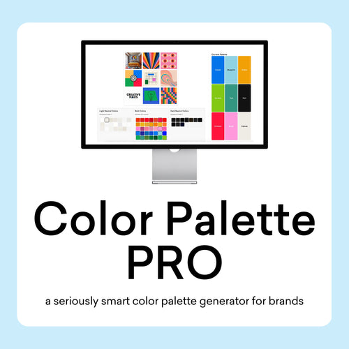
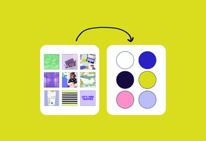
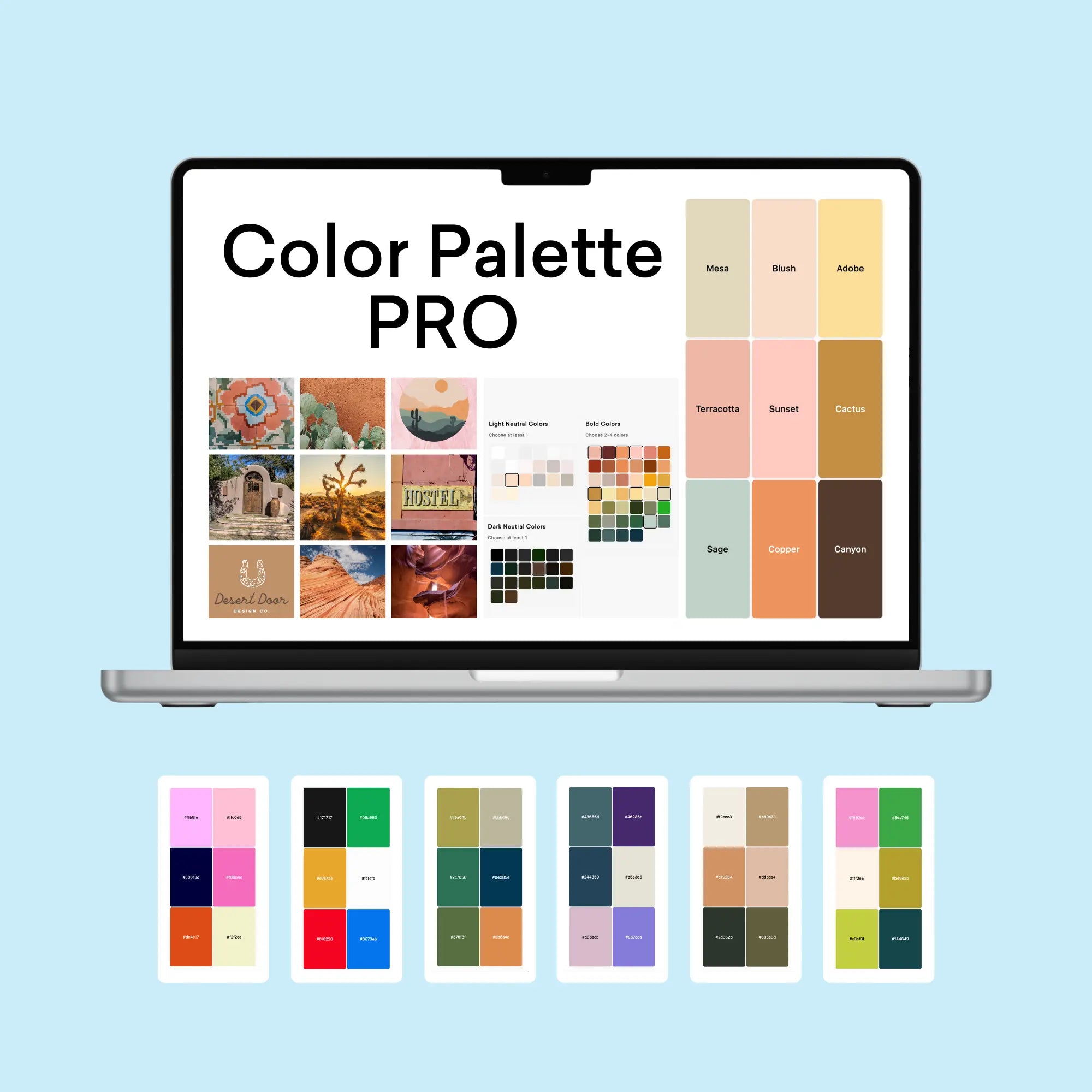
The process of creating professional color palettes benefits from specialized tools that ensure both aesthetic appeal and functional performance. Using our Color Palette Builder and complementary tools, designers can craft semi-custom color palettes that maintain perfect balance while meeting crucial web accessibility standards.
Strategic Color Development
The Color Palette Builder serves as your foundation for creating professional color palettes, offering built-in formulas that ensure harmony and accessibility. The tool guides you through a systematic process:
- Selection of design style that aligns with brand personality
- Built-in color recipes for foolproof combinations
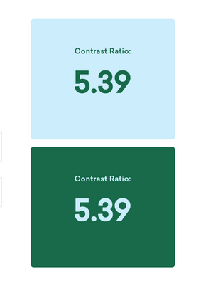
- Automatic contrast checking for WCAG compliance
- High-contrast pairing identification for accessibility
- Color validation across different applications
Each palette created includes strategically selected colors for:
- Primary brand colors that establish core identity
- Secondary accent colors for visual interest
- Supporting neutral tones for balance
- Accessible combinations for digital applications
Visualization and Application
The Brand Visualizer brings your palette to life by showing how colors interact in real-world applications. This step helps identify any potential adjustments before implementation and demonstrates how your palette performs across various design elements:
- Website components and UI elements
- Marketing materials and collateral
- Social media assets
- Brand documentation
Documentation and Guidelines
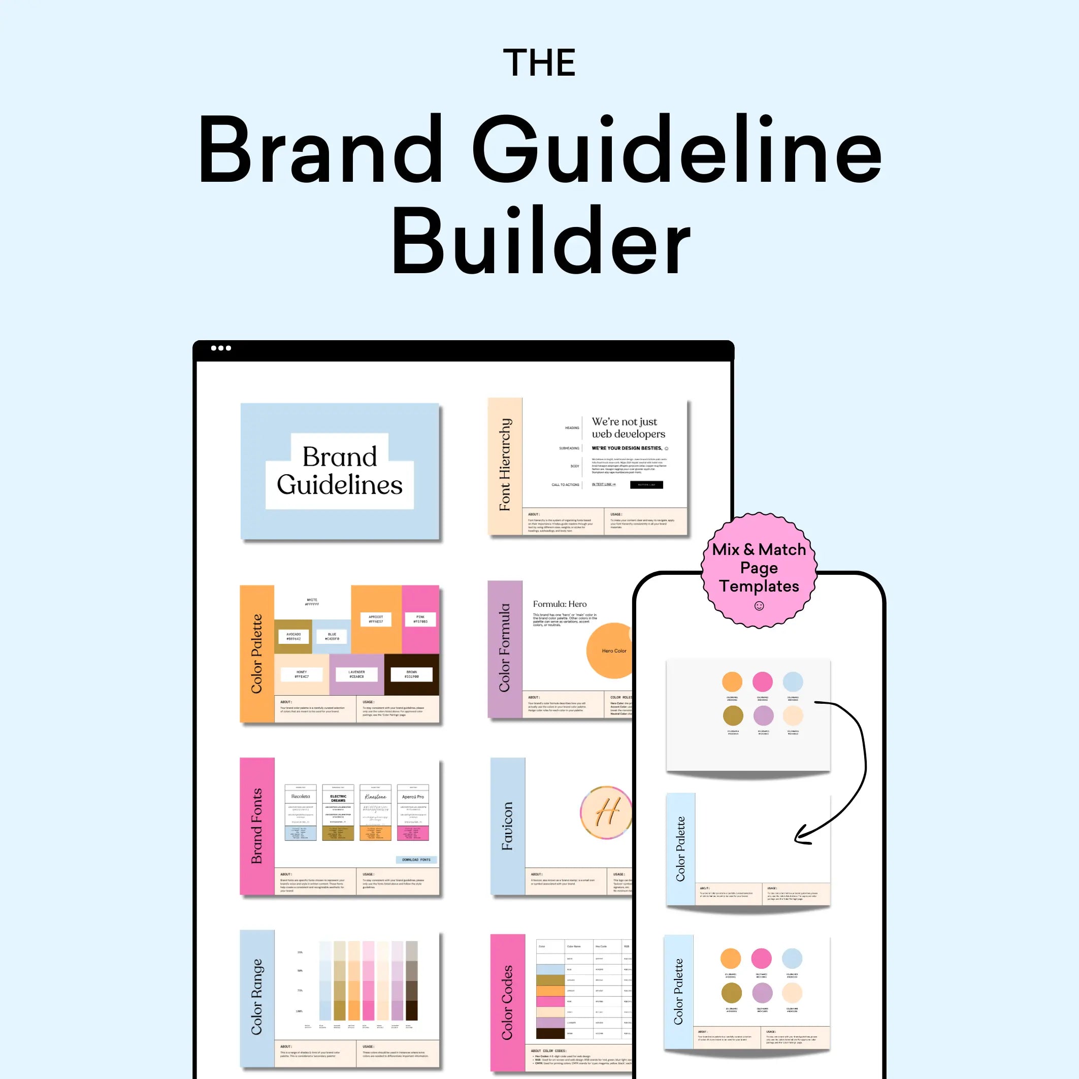
Use the Brand Guideline Builder to document your color palette with professional precision. This tool helps create comprehensive style guides that include:
- Color codes in multiple formats (HEX, RGB, CMYK)
- Usage guidelines and hierarchy
- Approved color combinations
- Application examples and restrictions
By following this systematic approach with our professional tools, designers can create color palettes that are not only visually striking but also practical and accessible. The integration between tools ensures a smooth workflow from initial concept to final implementation, saving valuable time while maintaining professional standards.
Final Thoughts
The Blueberry Blast palette demonstrates that working within a single color family doesn't mean limiting creative possibilities. Instead, it opens up opportunities for sophisticated, professional design that communicates both stability and innovation. By understanding how to leverage these varied blue tones effectively, designers can create powerful, cohesive brand experiences that resonate with professional audiences.
Ready to explore the possibilities of monochromatic design? Check out The Color Palette Builder (below), making it easy to create sophisticated single-color palettes that maintain visual interest while ensuring high contrast accessibility.


