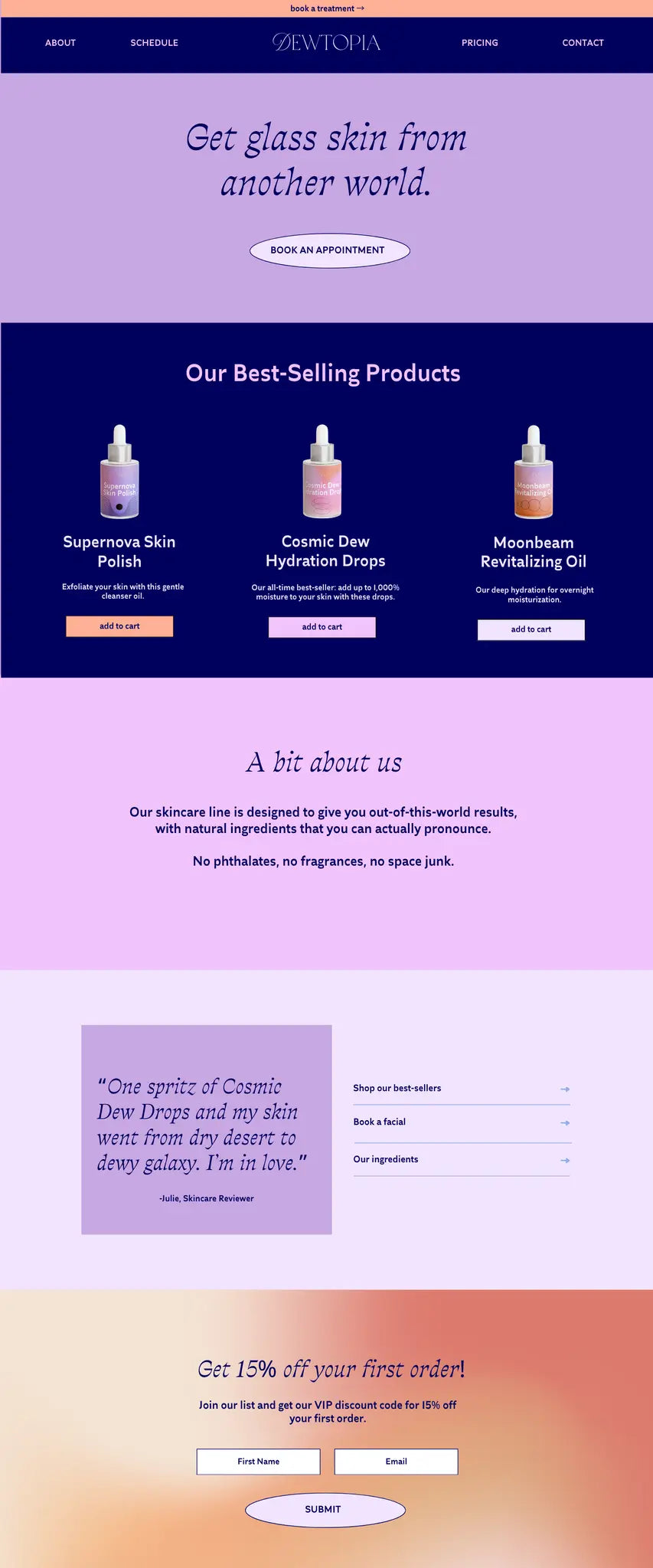
"I've noticed that most of the high quality brands go for a minimal and neutral vibe, so this is my way of having fun with a more bold & colorful take."
Welcome to Brand-in-a-Box, a series where I curate some font pairings, brand colors, and graphics/illustrations to create a ready-to-use brand!
For this week's Brand-in-a-Box, I wanted to create a skincare brand called 'Dewtopia' that had a colorful, galaxy-inspired vibe.
I'm a big skincare junkie, but I've noticed that most of the high quality brands go for a minimal and neutral vibe. So this is my way of having fun with a more bold & colorful take on premium skincare!
I hope you love this one. It was a really fun concept to play with. ☺
THE FONTS:
I looooove when I can use fonts from the same family, and the 'Traulhla' fonts perfectly captured the cosmic vibe l wanted. The 'Italica' version is sharp and totally unique, while the 'Lineara' version is easy to read and the perfect complement.

THE COLORS:
I wanted to lean more into dark, mystical backgrounds with this brand- which is why you'll see that navy blue used as the background color most often. I loved bringing in the cosmic pinks & purples- and the orange was a splash of fun energy.

THE GRAPHICS:
I found this pack of abstract linear gradients that perfectly matched the color scheme for the brand. I love how these feel a bit 'supernova-ish'. I also utilized the abstract shapes for a magical effect on the product mockups.

Here are the tools I used to create this 'Brand in a Box':
-
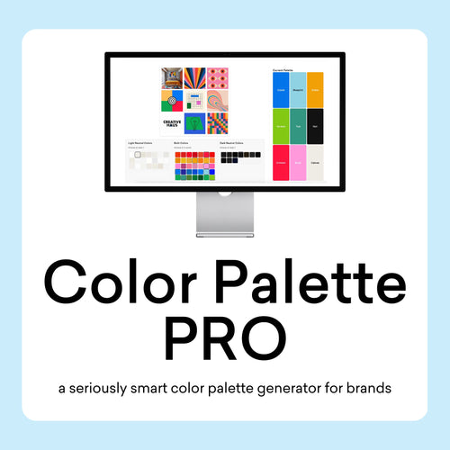
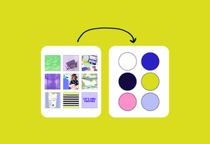
Color Palette Builder: to create the color palette (I used colors from the 'cosmic & ethereal' design style)
-
already have the Color Palette Builder? Use this link to auto-load this color palette into your builder!
-
-
Font Pairing Kit: to choose font pairings
-
Linear Gradients & Vector Elements: for the abstract backgrounds & linear shapes
-
Frosted Glass Dropper Mockups: for the skincare product mockups (they came with a cute foil effect that I loved!)
-
Brand Visualizer: for the website mockup ☺
About the Author

Sam Remboldt
I'm a self-taught graphic designer and serial entrepreneur based in Nashville, TN. I started The Color Palette Studio in 2023 and have built an incredible community around the joy of designing color palettes for brands. I create tools & resources to help brands create perfect color palettes using:
- psychology: how your colors influence emotions, perceptions, and behaviors
- business strategy: how your colors align with your vision and connect with your target audience
- graphic design: how your colors follow design principles of harmony, accessibility, & balance


