How to tell if your color palette is broken
Most palettes look good in theory but fall apart in practice.
Here's why:
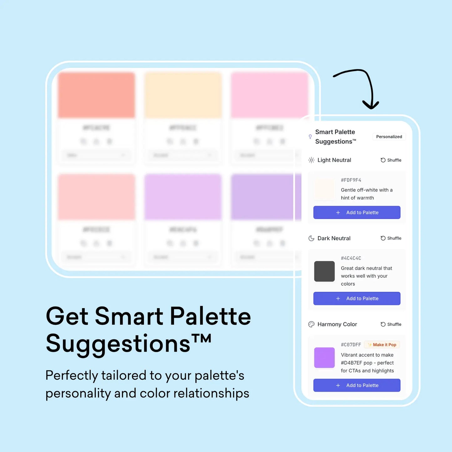
❌ Unbalanced mix — Too many brights, not enough neutrals
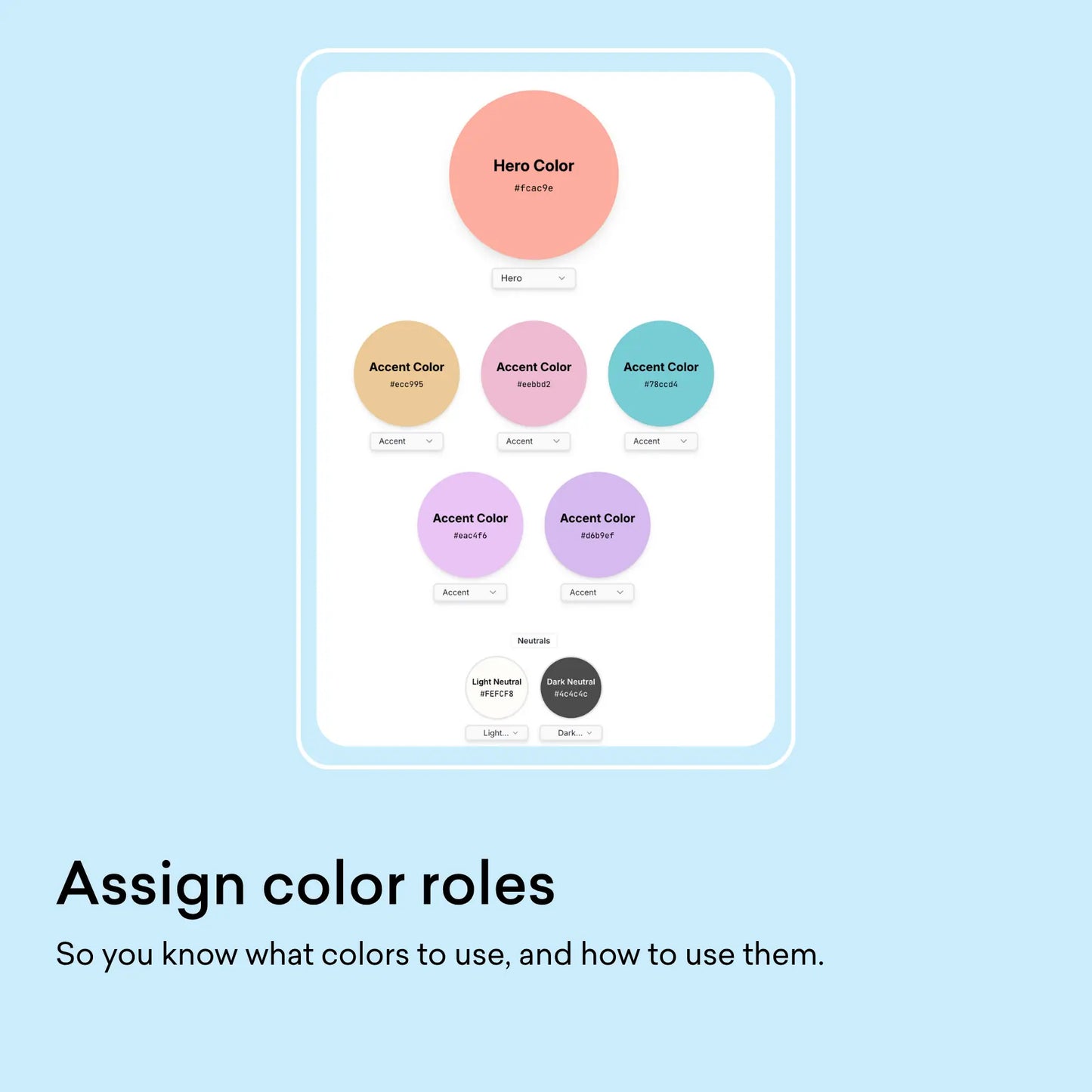
❌ No clear roles — When colors don't have assigned jobs (hero, accent, neutral), your designs look chaotic.
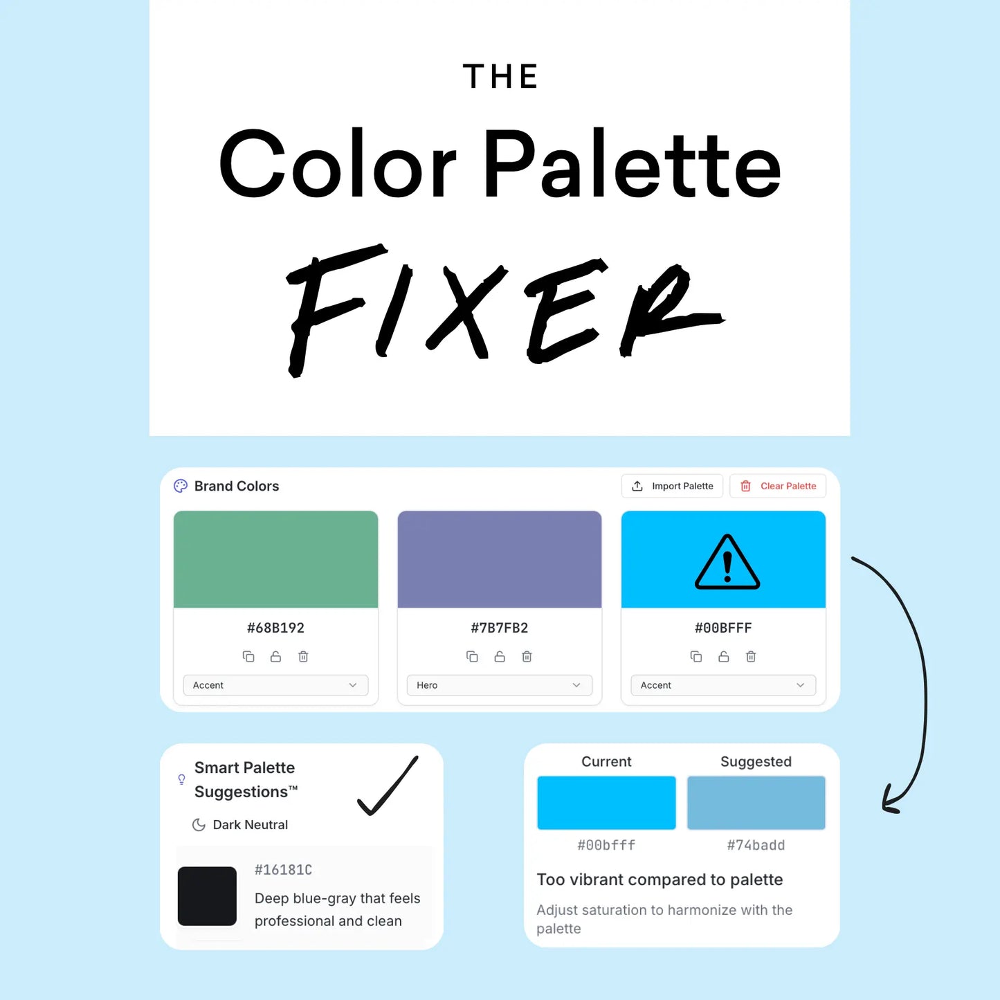
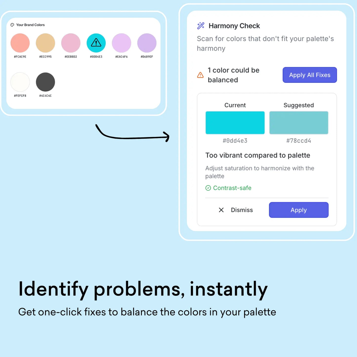
❌ Inconsistent harmony — One “off” color can throw the whole palette out of rhythm.
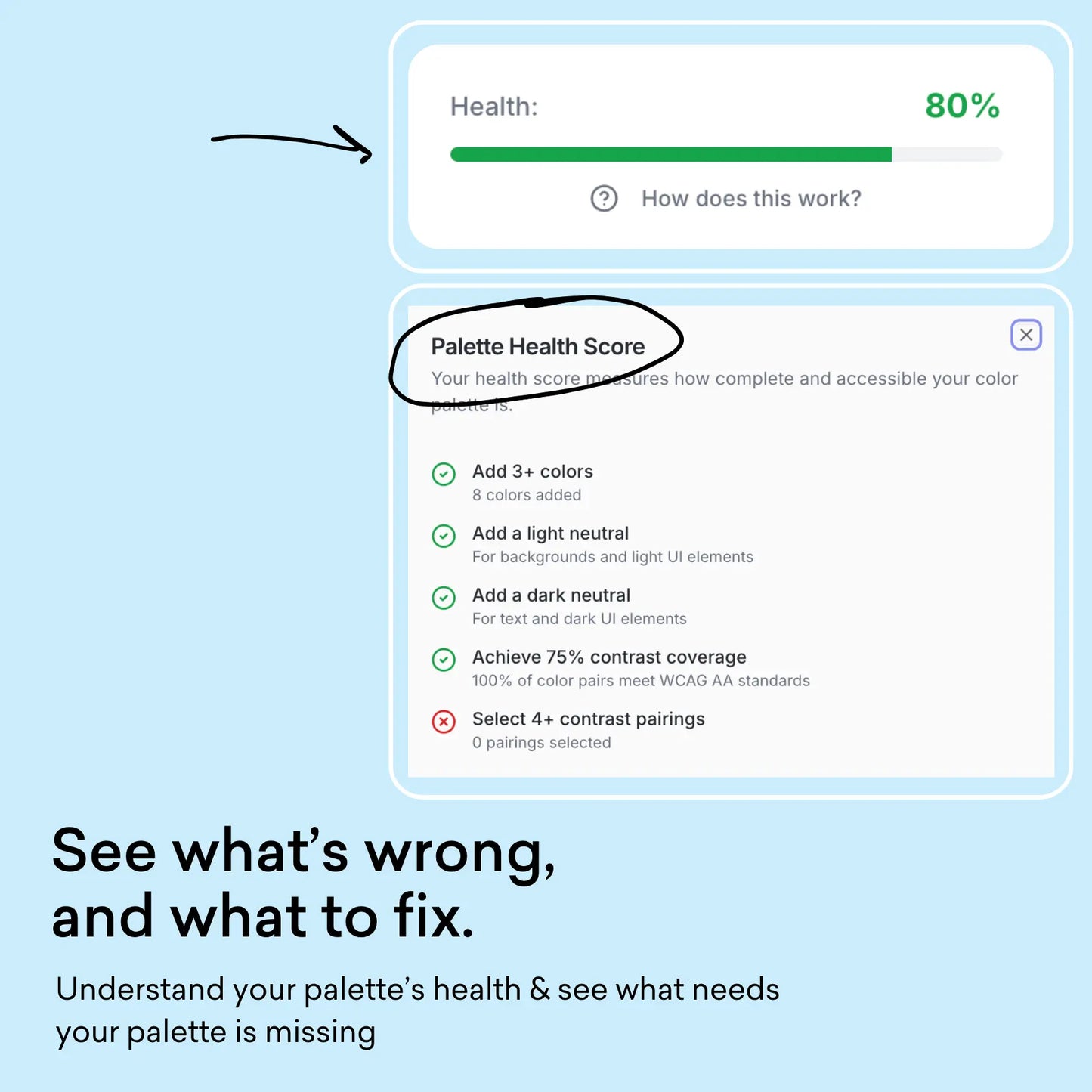
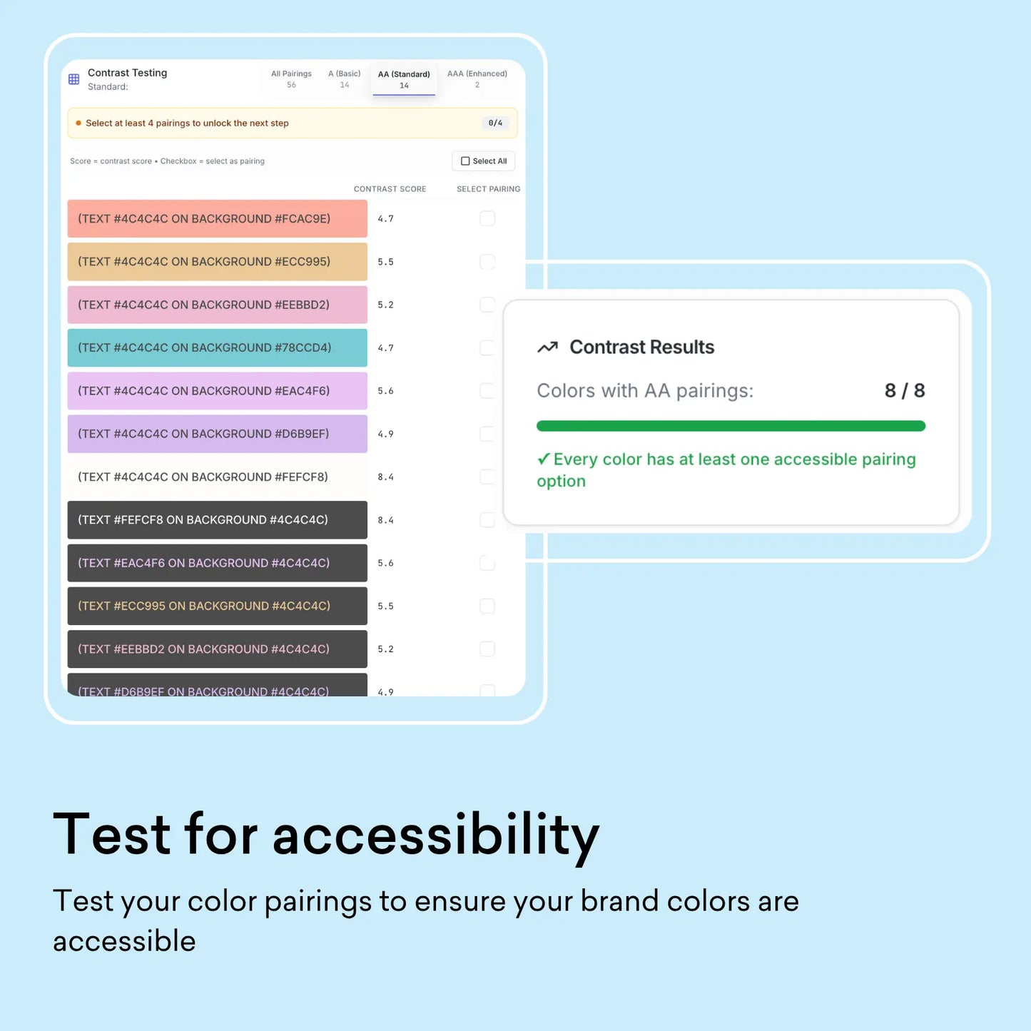
❌ Accessibility blind spots — Text that’s too light, colors that blend together, combinations that fail contrast checks.
❌ Not built for real life — A palette might look dreamy in a mood board, but it breaks when you try it on a website, Instagram post, or logo.
...sound familiar?

