Peach Daydream

Peach Daydream

Samantha Remboldt

There’s something delightfully refreshing about a warm, sunny palette, and “Peach Daydream” fits that vibe perfectly. These six colors effortlessly evoke feelings of relaxation and positivity—ideal for brands looking to stand out with a welcoming, uplifting presence. Whether you’re designing a beachy social media campaign or reimagining a product label for a summer launch, “Peach Daydream” can bring a burst of optimism to your creative work.

On the practical side, these soft peaches and bold oranges complement neutral tones beautifully, making it easy to maintain accessibility while still leaning into fresh, bright hues. For designers mindful of WCAG guidelines, consider pairing the lighter shades, like Seashell, with deeper tones, like Amber, to ensure clear readability. Overall, “Peach Daydream” offers a balanced, cheerful color scheme that can adapt to everything from brand identity overhauls to everyday marketing materials.
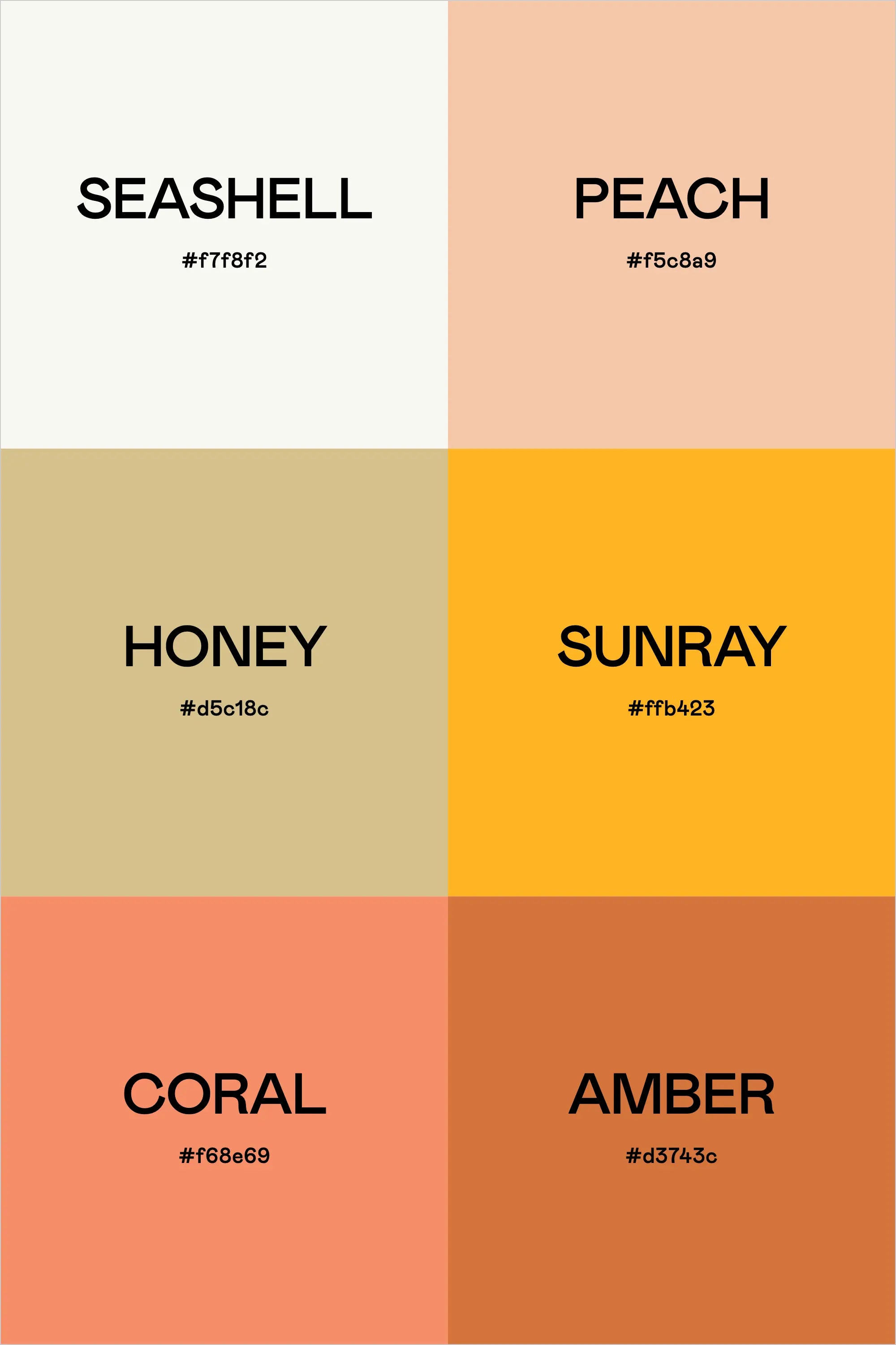
Colors & Hex Codes

  • Seashell – #f7f8f2
  • Peach – #f5c8a9
  • Honey – #d5c18c
  • Sunray – #ffb423
  • Coral – #f68e69
  • Amber – #d3743c
Back to blog

★ ★ ★ ★ ★

Say hello to your new favorite color palette tool:

Color Palette PRO

Excellent 4.97 | Trusted by 1,000+ Designers

Create beautiful, brand-ready color palettes in 60 seconds.

Our all‐in‐one tool helps you select, test, and finalize your brand’s perfect palette—without the guesswork.

Get Color Palette PRO

Read the Reviews

"Wow, I love this! It's insanely useful!! From generating themed names to contrast compliance - this tool is so much fun to use and saved me a ton of time."

Customer Reviews

Based on 69 reviews
96%
(66)
3%
(2)
1%
(1)
0%
(0)
0%
(0)
J
Julia B.
SO helpful

This tool has been an amazing addition to my design process. I'm so glad I got it! its such a time saver and it lays everything out really well. I highly recommend it!

M
Megan D.
I'm Obsessed!

I've been a fan of their tools from the beginning, but I've got to say the new Color Palette Pro is the best yet! As a web designer this is the first place I go to take my clients' inspiration and create a palette that's uniquely them, but also meets contrast guidelines. It's so much fun to use I could spend hours just creating amazing palettes. There's so much here, I could go on and on, do yourself a favor and grab this tool!

K
Kelly D.
The Graphic Designer's Best Friend

WOW! This is the best tool and I love using it regularly for branding, graphic design, and web development projects. I highly recommend it to improve your creative process. Bonus: it's super fun to use, too!

I
Ingrid U.
Saves me SO much time and it's fun to use!

I love playing with color and going down the rabbit hole of color psychology and this is so helpful in letting me explore different combinations and good balanced palettes!!

K
Krista H.
new and improved color palette pro

I love the color palette pro! It is so easy to navigate and very intuitive, and it allows you to create a great palette in a few easy steps.